The Most Useful Information with No Meaning

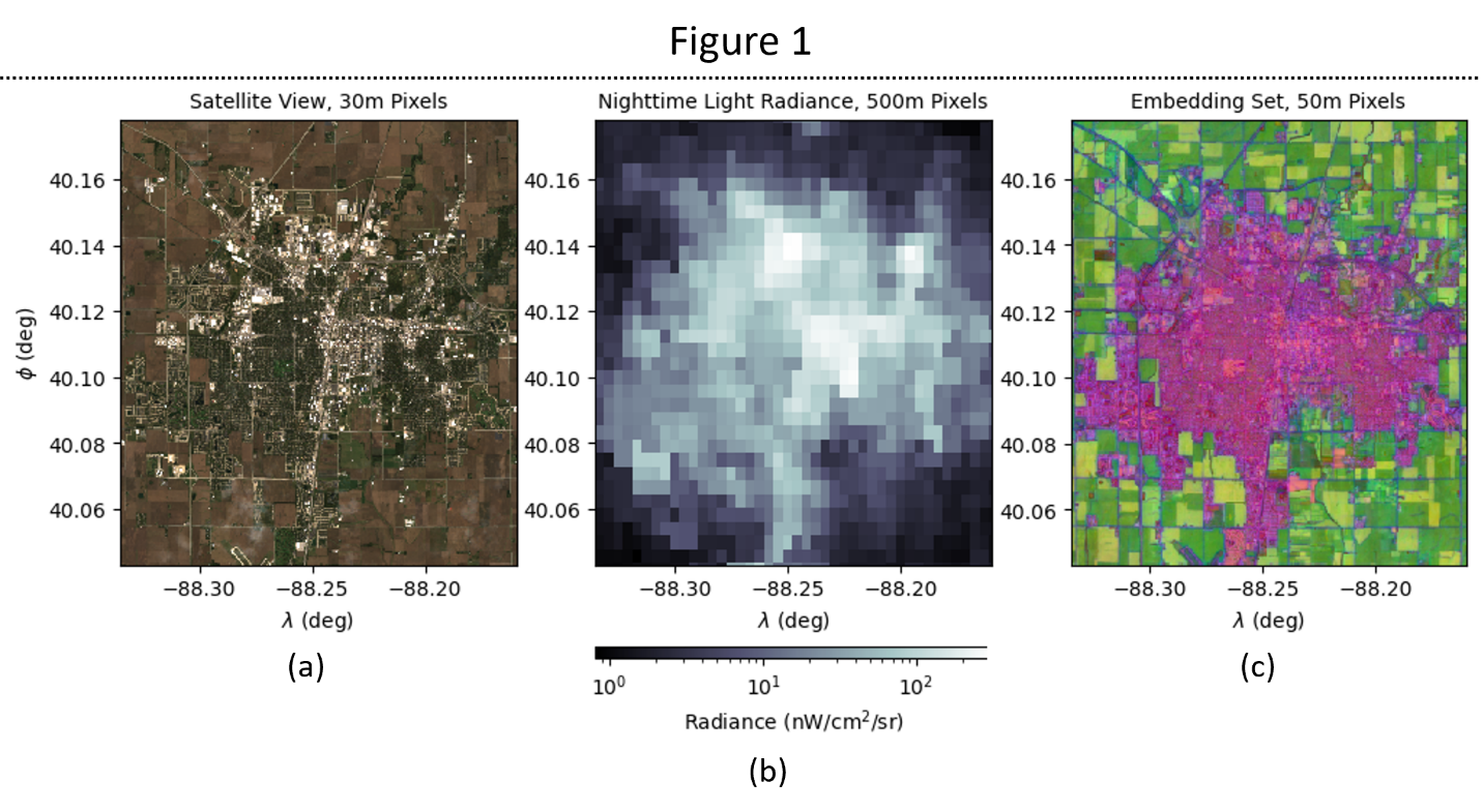
Figure 1: (a) Visible light satellite image, (b) VIIRS nighttime lights, (c) AlphaEarth embedding
The images in Figure 1 all depict Urbana, Illinois from 1/1/2024 – 1/1/2025. Figure 1a is a visible light spectrum satellite image from the Sentinel-2 L2 SR dataset. Figure 1b uses the same footprint, but each pixel has a value corresponding with the average brightness of nighttime lights taken from the VIIRS Monthly Day/Night Band Composite. Figure 1c shows data from the Google AlphaEarth Satellite Embedding.
The three images have some visual similarities and highlight similar physical features – all three highlight the urban/rural divide, with 1a and 1c showing even more similarity due to greater resolution. However, what do the colors on the AlphaEarth embedding mean? And what exactly is it showing?
What is the AlphaEarth Satellite Embedding?
The AlphaEarth satellite embedding is a global dataset that combines information from several dozen measurements taken from a wide range of datasets (Table 1S). These datasets were obtained from satellite videos and images collected since 2017, providing both images of the earth and measurements of properties such as elevation and air temperature at each point on the earth's surface at monthly or even daily intervals.
When combined, these datasets hold a wealth of information about the earth's surface and local processes. However, for many purposes, it is not necessary to store every measurement taken by these probes in one dataset. First, this dataset would be inefficient and difficult to store due to its size. Secondly, some components of the dataset provide overlapping information, either because they measure the same quantity (e.g. Sentinel-2 and LandSat data all contain measurements of visible and near-infrared light) or their measurements are closely related (e.g. the dewpoint temperature and surface pressure are strongly correlated with one another).
How the Embedding Works
To reduce the size of the dataset and remove redundant information, the information from these sensors was reduced to a 64-dimensional embedding vector. A deep learning algorithm was trained to take as input all the sensor data from a given 10m × 10m region of the earth (pixel) and combine them into 64 channels (dimensions) in a way that minimizes information overlap/redundancy and maximizes information content.
This reduces the total amount of memory required to store the data taken from the satellite measurements with minimal information loss. However, this is at the cost of interpretability: each dimension of the vector is created by combining measurements of wildly different quantities such as local temperature and elevation, so there is no way to assign any kind of physical meaning to them. Their combination into the feature vector is an abstract representation that contains almost all of the information from the satellite measurements with a reduced memory footprint.
Understanding the Visualization
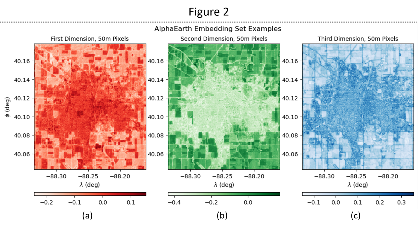
Figure 2: Individual dimension breakdown (a) First dimension, (b) Second dimension, (c) Third dimension
The satellite image (Figure 1b) is comprised of a set of three arrays with values ranging between 0 and 1. The value of the first array represents the amount of red light in each pixel, the second represents the amount of green light, and the third the amount of blue. Similarly, the image on the right shows the first three dimensions of the embedding vector represented as RGB values. For each pixel, the value of the first dimension corresponds with the redness of the pixel, the value of the second dimension is represented by how green the pixel is, and the value of the third dimension by how blue.
Interpreting the Patterns
While the dimensions of the embedding vector are not interpretable, they nevertheless clearly show similarities to the satellite image. The central urban area in Figure 1b is pink, meaning that the first and third dimensions (Figures 2a and 2c) have large values in urban areas and small values in rural areas, while the second dimension (Figure 2b) has large values in rural areas and small values in urban areas. Roads and city boundaries are visible in blue, while farmland is highlighted in green or yellow depending on the satellite image color.
While the quantities that these dimensions represent are not physical, it is clear that they are each sensitive to different features of the land. From the amount of information that is revealed by only three of the 64 dimensions in the embedding makes it evident that the full 64-dimensional embedding will provide substantially more information than a satellite image alone.
Why This Matters
The satellite embedding dataset provides a powerful way to characterize and compare different regions of the earth. It provides a way to efficiently analyze geospatial data by conglomerating a wide variety of physical quantities into a single dataset that minimizes the amount of redundant information. By removing this redundant information and reducing the amount of storage space required, embedding datasets are particularly useful for training deep learning algorithms, making them even more relevant in today's world.
All 64 Dimensions
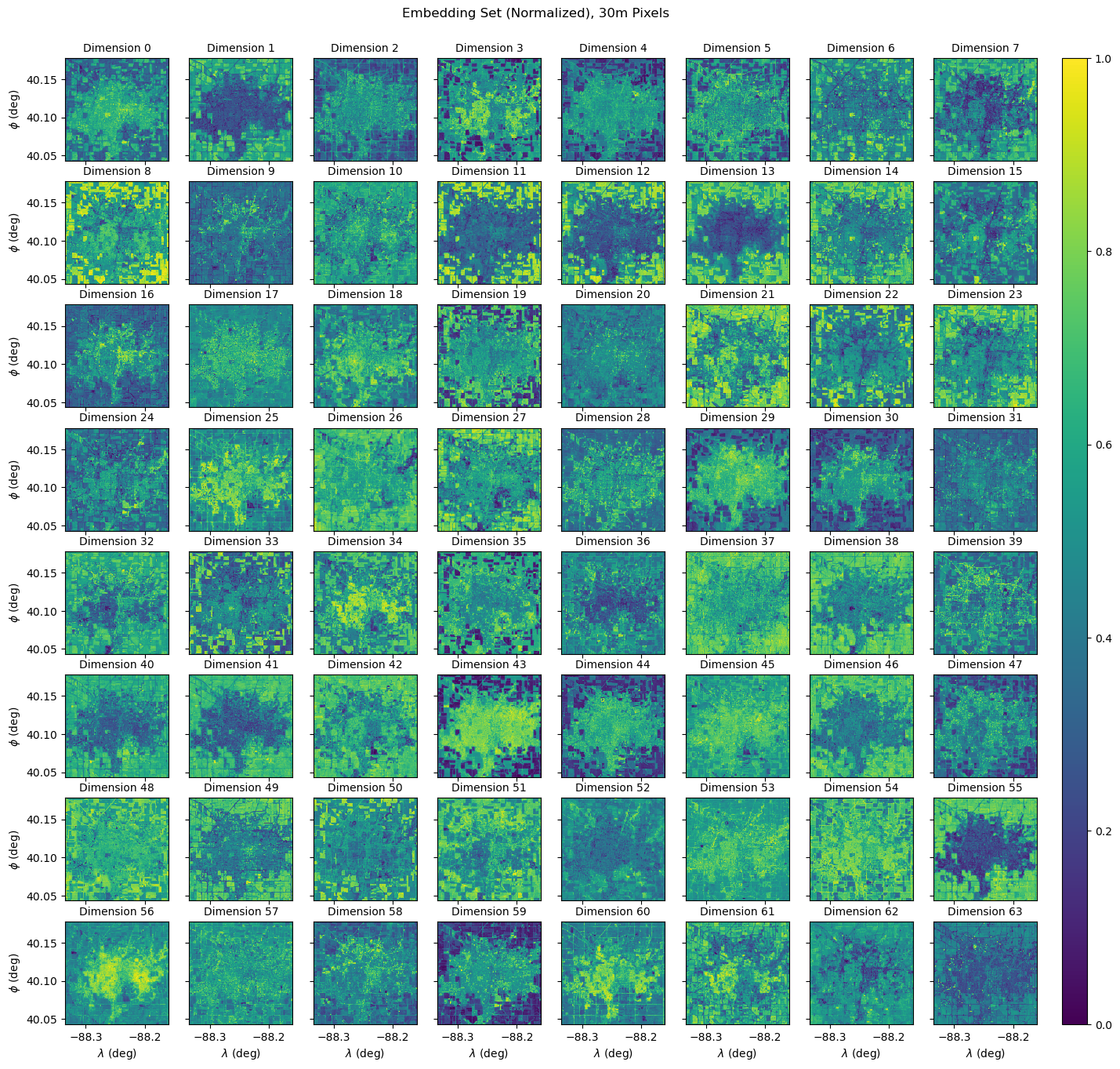
All 64 dimensions of the embedding set, independently normalized
For completeness, here are all dimensions of the embedding set. Each dimension is independently normalized so that all pixel values lie between 0 and 1, which ensures the full range is visible.
Can you take a guess about what kinds of features they might be highlighting?