Our Data Storytelling Journey at DSRS
The art of storytelling is an ancient and a persuasive one.
Although we had dabbled with data storytelling early in our corporate careers, we must admit that we paid little attention to the art of creating engaging visualizations until we met Professor Carrasco Kind in our Data Storytelling course last semester.
Professor Carrasco Kind’s keen eye for simple yet effective visualizations has helped us to imagine the countless possibilities in data storytelling. In a series of articles, we’d like to underscore some of the data storytelling principles that we leveraged under Professor Carrasco Kind’s mentorship at DSRS enabled us to come up with some compelling visualizations.
One of our first projects was to visualize the data from the research paper co-authored by Professor Moses Okumu – “Introduction of Disease Outbreak Resilience Index” (Koomson et al. - Social Indicators Research – 2022). The objective of the paper was “to provide a holistic measure for profiling households based on their readiness towards disease outbreaks.”
The paper introduced a multidimensional index that measures resilience across 4 dimensions – Water & Hygiene, Physical distancing, Energy & Communication and Economic Security & Resilience and presents the findings using Demographic and Health Surveys (DHS) data from ten countries in sub-Saharan Africa.
Our first question was to understand the intended audience for the visualizations – was it going to be the consumed by public or was it going to be helpful for the State to drive policy decisions or if it will be useful for international donors to make allocation decisions or if it was going to be a blend of the above constituencies.
When Professor Moses acknowledged that his object was to drive policy changes along with increasing the public consciousness – our visualization choices became simpler.
Our strategy was to first familiarize ourselves with the data by understanding the context and the dataset followed by a drawing broad strategy where we freely drew the different visualizations (stories) that we could share and ended up selecting the ones that we believed that resonated with our audience the most.Once we finalized on a visualization, we would simplify and declutter it by ensuring that we present a coherent story and not interesting datapoints as insights.
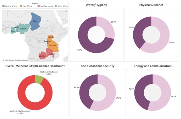
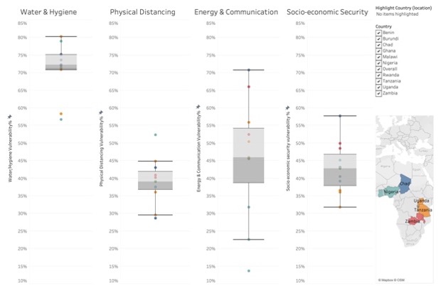
While designing a dashboard for the intended audience – there were two things that we needed to ensure – a measure that depicts the percentage of vulnerable households in a chosen country along with a comparison chart that helps understand its standing for a given dimension in relation to their peers. Our obvious choices were to have donut chart and a Box plot.


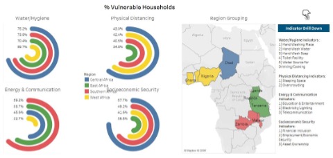
The second iteration of DORI dashboard was driven by our penchant for perfection and our drive to make the data more presentable and intuitive. Our numerous brainstorming sessions with a drawing board approach have led us to choose radial chart as the best alternative to represent the given data.

Some of our findings: Most of the vulnerable households among the dimensions like Water/Hygiene, Physical Distancing and Socioeconomic Security are concentrated in Central Africa. However, when it comes to Energy & Communication, Central Africa does marginally better than East and Southern Africa. Upon drilling down to the indicator level, it is observed that while Telecommunication and Education& Entertainment have a smaller number of vulnerable households, Electricity/Lighting is an immense pain point.
Overall, Western and Eastern Africa perform better than the Central and Southern Africa. Most households in sub-Saharan Africa lack Water/Hygiene facilities. The insight that around 89% of the households sourced their drinking or cooking water from outside their dwelling/yard/plot surprised us. Counterintuitively, the TB incidence rate is high in countries that are less vulnerable in terms of toilet facilities, sleeping space and overcrowding. Although we could make some educated guesses on why we see a phenomenon in the data collected – we refrained from making conclusive remarks given that we were dealing with healthcare data of the African Continent that we previously had little exposure to. However, throughout this journey, we tried to ensure that we captured the 5 eternal qualities of great visualizations – Truthful, Functional, Beautiful, Insightful and Enlightening prioritized in the same order.
Jyothi Movva was a Data Science Intern at DSRS. She worked in the Analytics space for about 3 years after her MBA. Her areas of interest are Machine Learning and Data Visualization to solve business problems.
Abhinay Yarlagadda is a Data Science Intern at DSRS. Having previously worked across multiple domains such as Finance, Insurance and Supply Chain – he loves to solve intractable problems through data wrangling.
Addendum:
Secondary data from the Demographic and Health Survey (DHS) was used for this study. To understand how individual countries adapt during outbreaks, the study mainly focuses on four sub-regional blocks of sub-Saharan Africa.
